What is Color Theory?
Color theory is a framework that explores how colors interact and influence human perception. It examines the relationships between different hues, shades, and tones to understand their psychological impact on viewers. By leveraging color theory, designers can convey specific emotions, messages, or meanings through their designs. For example, warm colors like red and orange are often associated with energy, passion, and excitement, while cool colors like blue and green evoke feelings of calmness, serenity, and trust.
Additionally, cultural and contextual factors influence color symbolism, further shaping how colors are interpreted. By strategically selecting and combining colors based on color theory principles, designers can effectively communicate and evoke desired responses from their audience.
Color Wheel Main Groups
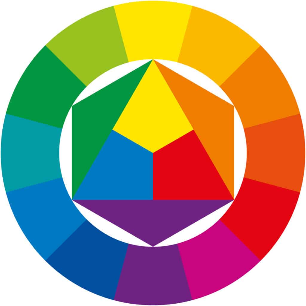
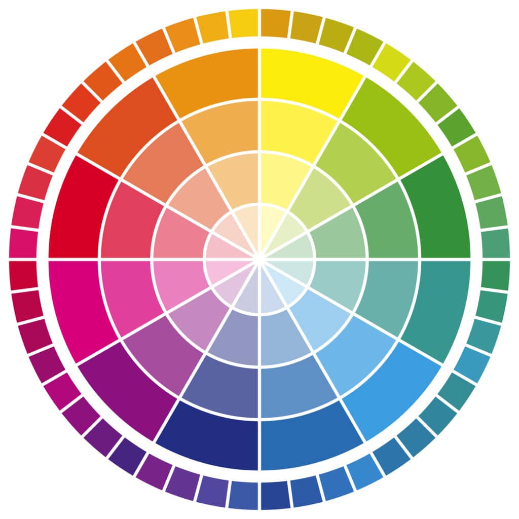
The color wheel is a fundamental tool in understanding how colors relate to each other and can be categorized into three main groups: primary, secondary, and tertiary colors.
- Primary Colors: These are the fundamental colors that cannot be created by mixing other colors together. There are three primary colors: red, blue, and yellow. All other colors are derived from combinations of these primary hues.
- Secondary Colors: Secondary colors are created by mixing equal parts of two primary colors. There are three secondary colors: orange, green, and purple. These colors sit equidistantly between their component primary colors on the color wheel.
- Tertiary Colors: Tertiary colors are formed by mixing a primary color with a secondary color adjacent to it on the wheel. This results in six tertiary colors, including red-orange, yellow-orange, yellow-green, blue-green, blue-purple, and red-purple. Tertiary colors offer a wide range of nuanced shades and tones.
Understanding the relationships between primary, secondary, and tertiary colors on the color wheel enables designers to create harmonious color schemes, balance contrasts, and evoke specific moods or emotions in their designs.

Relationships of Colors
Colors interact with each other in various ways, forming relationships that can enhance or diminish their visual impact. One essential aspect of color relationships is color harmony, where colors complement each other to create visually pleasing combinations.
Complementary colors are those positioned opposite each other on the color wheel, such as red and green, blue and orange, or yellow and purple. When placed together, complementary colors intensify each other, creating dynamic contrasts that draw attention.
Analogous colors, on the other hand, are adjacent to each other on the color wheel, such as red, orange, and yellow, or blue, green, and yellow-green. Analogous color schemes offer a sense of unity and cohesion, as they share similar hues and evoke a harmonious, natural feel.
Triadic color schemes involve three colors evenly spaced around the color wheel, such as red, blue, and yellow. Triadic combinations offer a balanced contrast of warm and cool tones, creating vibrant and visually engaging compositions.
Understanding these color relationships allows designers to effectively use color to convey messages, evoke emotions, and create aesthetically pleasing designs that resonate with viewers. By carefully selecting and combining colors based on their relationships, designers can achieve impactful visual compositions.
What Colors Mean to Web Users
Different colors can evoke specific emotions and convey messages to web users. Here is how certain colors are usually perceived:
Red: Often associated with passion, energy, and urgency, red can be attention-grabbing and stimulating. It is commonly used for calls to action or alerts on websites.
Orange: Orange often symbolizes enthusiasm, vitality, and warmth. Orange can stimulate action and convey a sense of friendliness and approachability, and it is often used to create a sense of excitement or energy on a webpage.
Yellow: Representing optimism, happiness, and creativity, yellow can evoke feelings of warmth and positivity. It is commonly used to draw attention or highlight key elements on a webpage.

Green: Linked to nature, growth, and health, green conveys a sense of freshness, balance, and tranquility. It is often used for environmental or wellness-related websites.
Blue: Symbolizing trust, stability, and professionalism, blue is a popular choice for corporate websites and brands aiming to establish credibility and reliability.
Purple: Purple signifies luxury, sophistication, and spirituality, and it can create a sense of elegance and creativity. It is often chosen by brands targeting a more upscale or artistic audience.
Black: Black symbolizes power, elegance, and sophistication, which creates a sense of mystery and intrigue. It is commonly used for minimalist designs or to convey a sense of luxury.
White: Representing purity, simplicity, and cleanliness, white creates a sense of spaciousness and clarity. It is often used as a background color to enhance readability and create a modern, minimalistic aesthetic.
By understanding the psychological impact of different colors, web designers can strategically use color to evoke desired emotions, reinforce branding, and enhance user experience on websites.
Choose Performance Driven Marketing
At Performance Driven Marketing, we know the importance of color theory in web design. We have a skilled team that can take your goals and vision for your website or brand and turn it into a reality. We also offer comprehensive services like content writing, web development, and SEO marketing so you don’t have to worry about anything. Contact us today to request a consultation and see how we can help take your business to the next level.


