
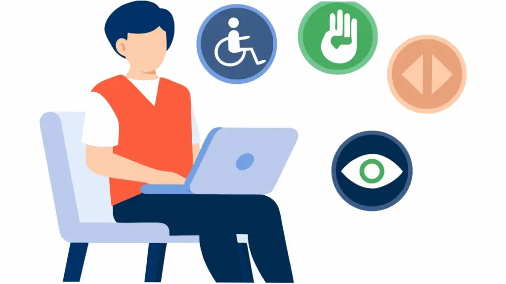
Millions of people live with visual impairments and rely on assistive technologies to browse the web. This is why website accessibility is essential for both user experience and the success of your business. Accessible websites can increase audience reach, improve customer trust, and complement SEO efforts. Keep reading to learn some practical ways to make your website easier for people with visual impairments to use your website.
Why Website Accessibility Matters
Inaccessible websites can unintentionally exclude potential customers who use screen readers, screen magnifiers, voice navigation software, high-contrast or monochrome settings, or keyboard-only navigation.
Accessibility improvements provide a better user experience for everyone, not just those with disabilities. All users can benefit from easier navigation, improved readability, faster content discovery, and better mobile usability.
Additionally, there’s significant overlap between accessibility best practices and SEO. Search engines favor proper heading structure, descriptive image text, organized content, clear navigation, and fast-loading pages — all elements of an accessible site.

Understand How Users with Visual Impairments Browse the Web
The first step in improving your website’s accessibility is understanding how users with visual impairments browse the web.
Many blind people use screen readers, which read aloud the text on the page, allowing them to navigate through the site without being able to see it. This software typically reads content from top to bottom, including the alternate text for any images. It relies on semantic HTML — descriptive elements — to interpret the page’s structure.
Another tool many visually impaired users rely on is screen magnification software, which enlarges content and makes it easier to see. This is one of the reasons why responsive layouts and scalable text are so important.
Finally, many users adjust their display settings to increase or decrease contrast or colors for readability. Some with light sensitivities even set their screen to grayscale. Others are color blind, which means they can’t reliably distinguish between colors. This means websites shouldn’t rely solely on color to communicate information.
Use Proper Heading Structure and Navigation
Using proper heading structure isn’t just great for search engines — it’s also essential for assistive technology like screen readers, which need to be able to understand how the site is structured. Best practices include using one H1 per page, H2s for major sections, and H3s for supporting topics. Avoid skipping heading levels. You should also use meaningful, descriptive section titles rather than vague labels like “More Information”.
Keep menus consistent, as well — the menu should be placed consistently across pages and use familiar navigation patterns. You can also add “Skip to Main Content” links to help keyboard and screen reader users avoid repetitive navigation.

Make Multimedia Accessible
Alt text describes an image, allowing screen readers to tell users what it’s an image of. Writing helpful alt text includes describing the purpose of the image, keeping descriptions concise, and leaving off the alt text for purely decorative images.
Include closed captions for videos, along with audio descriptions when appropriate. For audio content, provide transcripts and include written summaries when possible.
In addition to assisting those with screen readers, these accessibility improvements can help with SEO, as well. Search engines also use alt text and captions to understand media’s content and determine whether the page is relevant.
Improve Color Contrast
Even people without visual impairments can have a hard time reading text when the contrast is too low. Make sure text contrasts enough with the background that users with low vision can read it. You can use an online tool like WebAIM’s Contrast Checker to verify that the colors are suitable.
Furthermore, don’t rely on color alone — this could cause users with grayscale displays or color blindness to miss out on critical information. Error messages should include icons or text, charts should have labels and patterns in addition to colors, and links should have visual indicators (like underlines) besides color changes.
Make Text Easier to Read
Ensure text is readable — use clean, simple fonts and avoid decorative lettering for body text. As far as size goes, a good rule of thumb is for body text to be at least 12pt and large text to be at least 18pt. Users should also be able to zoom up to 200% without breaking the page’s layout. Make sure you use appropriate line spacing, as well — there should be space between paragraphs and white space in the margins.
Write Meaningful Link Text
Write meaningful link text — instead of generic “click here” or “read more” text on buttons, describe what the link actually does. For example, “View Pricing Plans” or “Contact Our Team”. This helps improve navigation for those who use screen readers.
Build a Better Website with Performance Driven Marketing
At Performance Driven Marketing, our team of web designers and developers can help you create a website that’s not just great for SEO, but accessible to everyone. If you want to enhance accessibility and increase customer engagement, contact us today to schedule a free website consultation to identify areas of improvement.