
Mobile Website Design

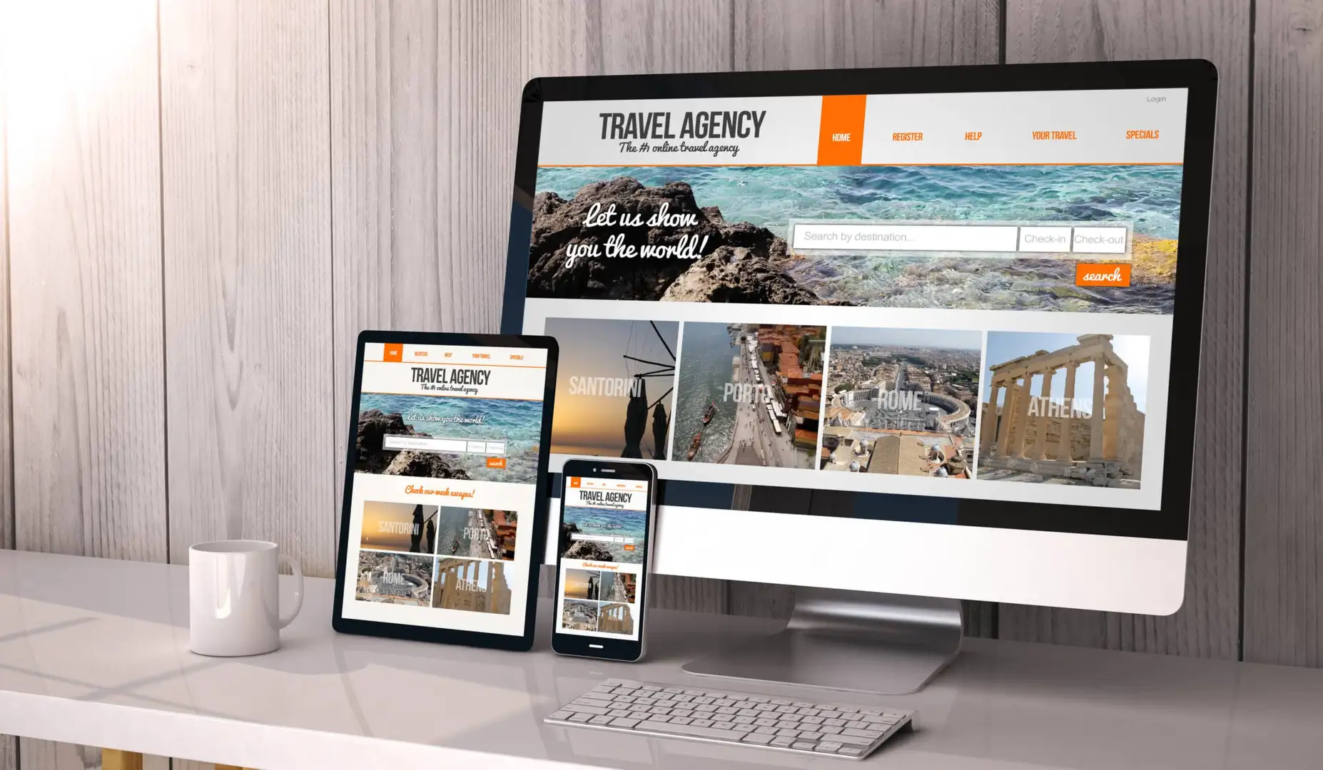
Almost everyone in the world has a smartphone or tablet, which they often use to access the internet. If your business isn’t capitalizing on the mobile user market, you are missing out on customers who could become regular customers. Designing a website that more visitors can access, from a variety of devices, you will set up your business for better search visibility and reduce bounce rates.
Google gives preference to mobile-optimized websites, meaning that if your target audience is on a mobile device, optimizing for mobile will increase your website traffic significantly. Performance Driven Marketing helps you to optimize your webpages for desktops, smartphones, and tablets. Fitting a website on a smaller screen can be challenging for a beginning web developer, but it is worthwhile to convert viewers into customers.
The Importance Of Mobile First Design
With the rise of mobile devices and online shopping, users are more likely to purchase from your business. Cell phones can be used from a car, work desk, or when out to lunch, allowing customers to make an impulse purchase without needing to make the trek to your brick-and-mortar business. Mobile websites that have fast load times, easy navigation, product search options, and a checkout page with multiple payment options will help more customers to go through with a purchase on your website. These customers are also more likely to return if they have a pleasant first experience.
Creating A Responsive Design
Not only should your website be optimized for mobile, but it should also load quickly for all users. Loading times should be similar across all platforms if you want to avoid customers from clicking off your website. If images, text, or listings don’t load within about 3 seconds, users will leave. You have a matter of seconds to catch the attention of users and ensure that they can use your website for the long term. When users leave a website, Google can also penalize your website, lowering your rankings on search results. Responsive web design will help a business gain more customers through proper information listed on their site and faster load times.
Steps Needed To Create A Mobile Website
If you are looking to optimize your website to a mobile-friendly format, there are a few things you should focus on. While there is no switch you can flip to change your website to a mobile-friendly website easily, there are a few areas you can focus on.
- Use Google’s mobile-friendly test to see if your website is optimized for all mobile devices
- Create a simple navigation menu that is easy to use on a small screen
- Break up text or use concise headers so that large blocks of text aren’t created on a mobile device
- Make large buttons and links that are easy to click with your finger
- Ensure CTAs (call-to-actions) are prominent and easy to read
- Utilize white space to your advantage, adding padding around important elements to limit clutter
- Optimize images by compressing them and labeling them with descriptive titles, removing underscores as well
Why Not Create A Separate Website For Mobile Users?
One, because you don’t need to, and two, this could confuse your customers or new people who come across your products. With the right web design and optimization techniques, your site will work across multiple devices without needing to completely change or make a new website. Creating a separate website that has a different URL can be confusing and will also compete with your other website for the top of search results. It is not recommended that a business have multiple websites, unless they offer different services on each one.
Modern Design From PDM Utah
Performance Driven Marketing has helped hundreds of clients create optimized websites that rank in the top spot of Google search results. Our web developers have experience working with websites in all industries, allowing us to know what works and what doesn’t for your website. Not only do we create visually appealing websites that run well on desktop, but we also optimize every site for mobile. You won’t have to worry about your mobile users and reaching new clients on their smaller devices when you work with our team.
PDM uses WordPress to host and develop our websites, so that clients can easily make adjustments or add new content when needed. Your website will look appealing and be easy to navigate for all people when you work with our experts. Responsive design will adjust automatically for any device, allowing all businesses to reach new customers and keep them coming back to purchase other products.
Demolish Your Sales Goals
Discover the exact number of leads you need to hit your revenue targets.
Testimonials
The Proof is in the Profits
Unsure if you can achieve the same results? Here are some of our clients and how working with PDM in the long-term can increase your revenue.
87%
Increase in
client revenue
50%
Increase in lead
quality
-
We have been with PDM for 10 years now .They are the best at what they do and for us that is making our phone ring. They are very innovative and keep us on the cutting edge of internet marketing . We recommend them to everyone.

Kyle Gomm
Advanced Door -
We have been working with PDM for the last 11 years. They have always been there for us. They are reliable and easy to work with. Most importantly, they get results!

Bryan Borne
Bronco Fence -
Vic and his team at Performance Driven Marketing have increased sales for my company just in the first couple months that I have been working with them. They also have done a great job with our business cards and brochures.

Kent Isaccson
Brush Brothers Painting -
Over the years I have never stayed with a marketing company longer than a year with just so-so results. PDM has actually listened to me. I got more leads and the quality of leads were much better! Very happy

Eddy Correll
Multiman Services -
“Performance Driven Marketing has been outstanding to work with. They have really helped our company stay on top of everything “internet.” I can honestly say that they have helped us increase our business.”
Joni Bailey
Rocky Mountain Movers -
“Victor and his team built our website at Goff Plumbing and I couldn’t be happier! What an amazing company to work with. Their name says it all, I’ve seen great results!”

Malachi Goff
Goff Plumbing -
“We have used Performance Driven Marketing for 4 years now. They have given us results. They are fantastic at solving problems that seem to come up in this ever changing SEO market. We had used 4 companies before them that gave a lot of promises, but did not give us results in the time they said was needed…but they did keep our money. Victor’s team is great!”

Wayne Rappleye
Genuine Comfort